One system, different priorities
The dashboard keeps a consistent foundation while surfacing different information for visitors, artists and staff.
02 / UX/UI Design
A customizable festival dashboard designed to give visitors, artists and staff a clearer way to plan and experience Lumiere.
Creative direction / UX/UI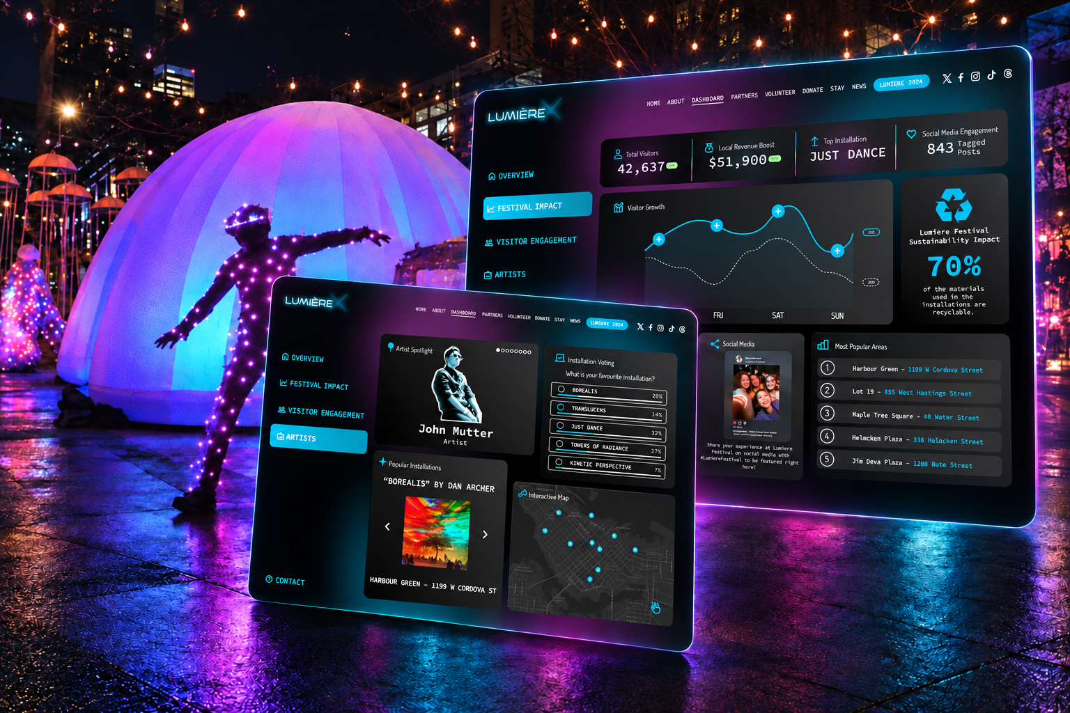
What the work needed to do
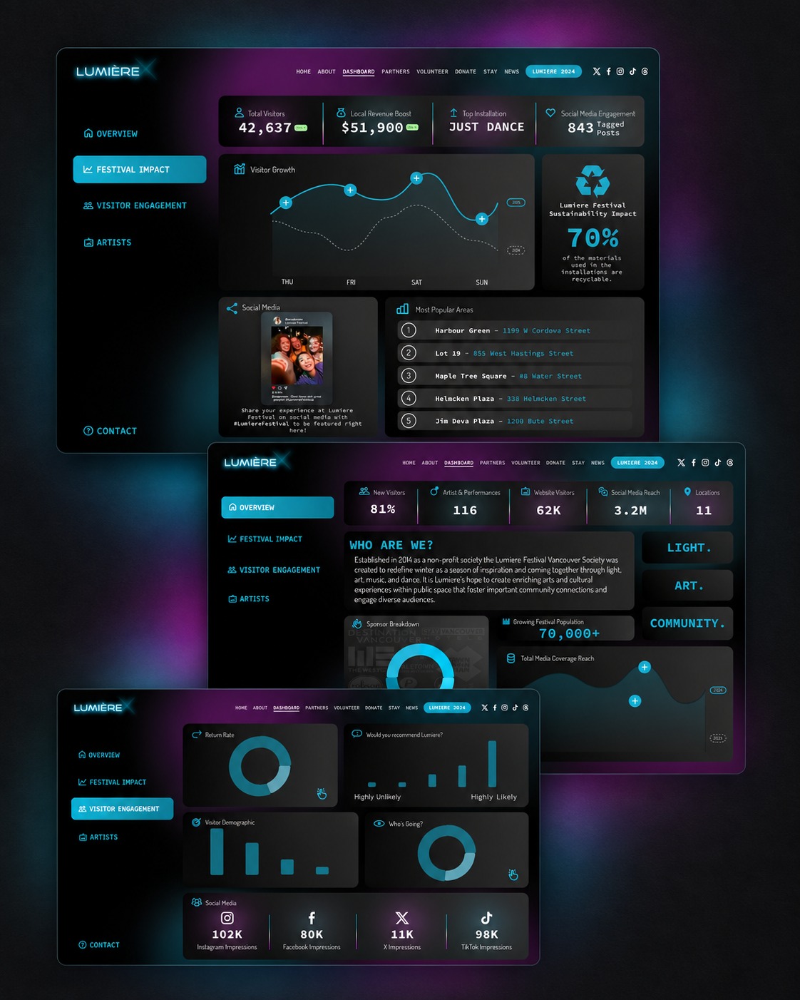
The choices that shaped the final direction.
The dashboard keeps a consistent foundation while surfacing different information for visitors, artists and staff.
Navigation and utility stay restrained so installations, artist information and festival imagery remain the visual focus.
Saved work, schedules and location-aware information were treated as practical tools for people experiencing the festival in real time.
Process / Evidence
The core design work was completed in roughly two weeks within a month-long project, so the team prioritized the clearest shared structure first.
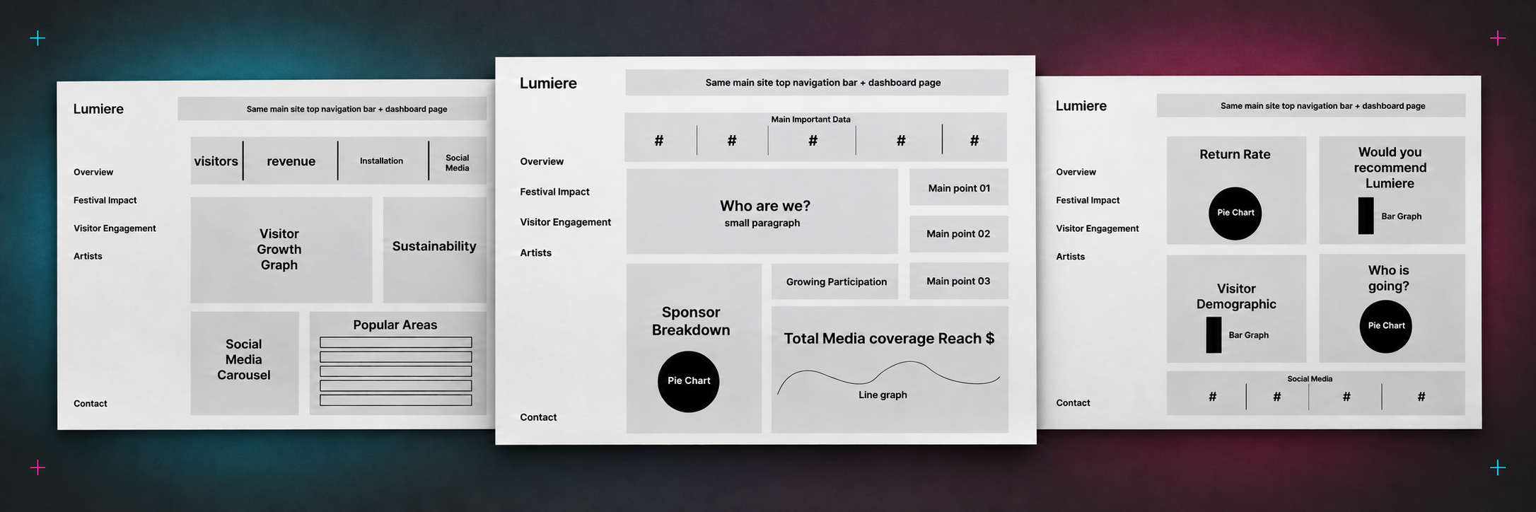
Class testing and a short questionnaire helped compare approaches before the final dashboard direction was consolidated.
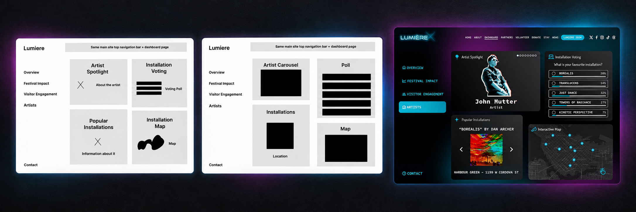
The final package combined an interactive prototype, clickthrough and presentation so the client could understand both the interface and the reasoning behind it.
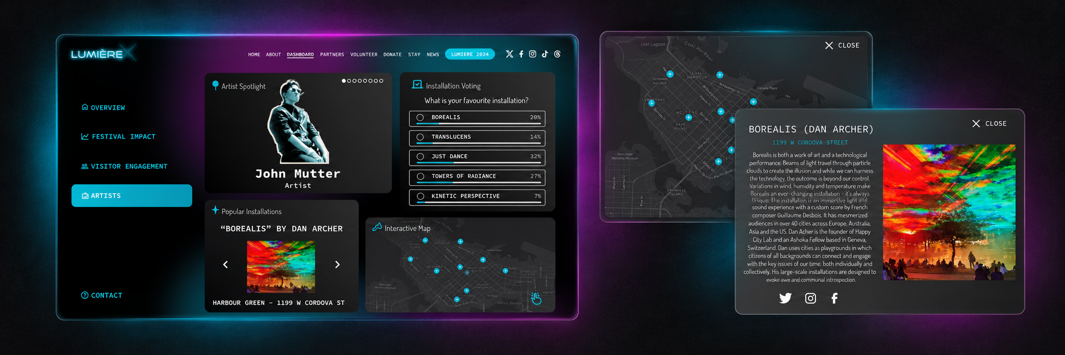
We led the creative direction and planning, shaped the interface, made final design decisions and brought the prototype, clickthrough and presentation together for the client.
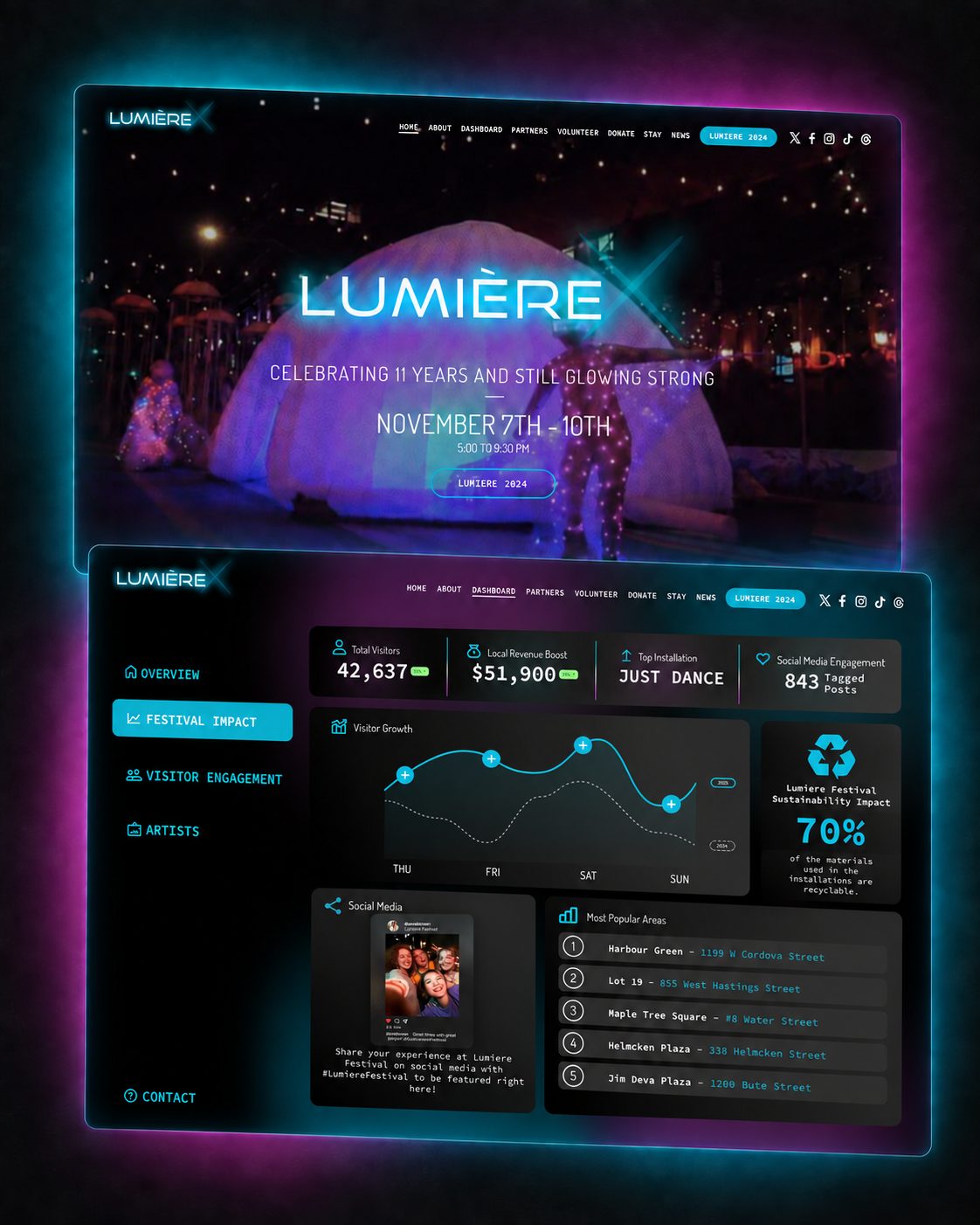
The final concept was presented to the Lumiere team, with positive feedback on the overall direction and artist experience. The work did not progress into a tracked launch, so no operational or attendance result is implied.
Lumiere shows how creative direction can create continuity under time pressure: align the team, reduce competing ideas and make the final experience feel authored rather than assembled.